
MyHealthfinder
Transforming Complex Information Into Actionable Insights

Simplifying complex information systems, creating intuitive user journeys, and designing accessible interfaces that drive measurable business results—skills directly transferable to commercial platforms.
Client: Office of Disease Prevention & Health Promotion
Role: UX Design
Timeline: 26 weeks, completed 2023
Impact: 2023 ClearMark Award Winner for Best Digital Product
The Challenge
The Office of Disease Prevention & Health Promotion needed to redesign MyHealthfinder, a platform providing personalized preventive health recommendations. Key issues included:
Confusing navigation preventing users from finding essential information
Unclear content presentation making recommendations difficult to understand
Poor information architecture hiding over 100 health topics in English and Spanish
Ineffective personalization tool lacking clarity
Need to better serve Black and Hispanic women for an upcoming campaign

Initial homepage & topic pageDiscovery
I led comprehensive research to identify improvement opportunities:
User testing revealed navigation pain points and content comprehension issues
Analyzed user paths to identify where users abandoned the recommendation process
Conducted card-sorting sessions using OptimalSort to understand users' mental models for health topic categorization
Initially planned to organize content based on internal assumptions, but pivoted to user-driven categorization when card sorting revealed unexpected mental models
Found users needed clearer pathways to content and preferred browsing multiple topics before selection

Affinity mapping in FigjamProcess
I followed a collaborative, iterative approach using Figma for design and prototyping

Information Architecture Redesign
Revamped navigation for clearer access to key sections
Developed new topic categorization based on card-sorting results
Organized recommendations into logical categories (scheduling visits, pregnancy information, etc.)

Homepage Transformation
Created a new hero section clearly introducing the site's purpose
Restructured to highlight both the recommendation tool and health topics
Initial prototype featured a traditional sidebar navigation, but user testing showed 78% preferred our tab-based approach

Topic Pages Optimization
Replaced confusing dropdowns with clear "The Basics" and "Take Action" tabs
Transformed passive language to active, personalized messaging
Redesigned headers to improve information hierarchy

Design System Development
Created a completely new design system, departing from ODPHP's existing visual language
Developed modular components that could be reused across the platform
Established clear documentation for future expansion
Prototyping
Low fidelity wireframes


High fidelity mockups

The Solution
The redesigned platform delivered:
Intuitive homepage highlighting both recommendation tool and health topics
Streamlined recommendation system with six distinct, actionable categories
Simplified tab-based navigation replacing confusing dropdowns
Enhanced visual design with improved imagery and clearer information hierarchy
Mobile-optimized experience with consistent usability across devices
Full bilingual functionality in English and Spanish
The redesign specifically addressed the needs of Black and Hispanic women through diverse representation in photos, content that accommodated varying literacy levels, and complete Spanish translations.

Current results pageImpact
The redesigned MyHealthfinder achieved:
2023 ClearMark Award for Best Digital Product, recognizing excellence in plain language communication
Improved content discovery with users accessing 48% more health topics on average
Reduced time to find relevant information by 40% based on task completion testing
Enhanced accessibility for Spanish-speaking users with 100% translated content
Created a foundation for future campaigns targeting underserved populations
Award judges specifically praised the "user-friendly interface and focus on providing actionable information."
The tool is now live and available for the public to use.

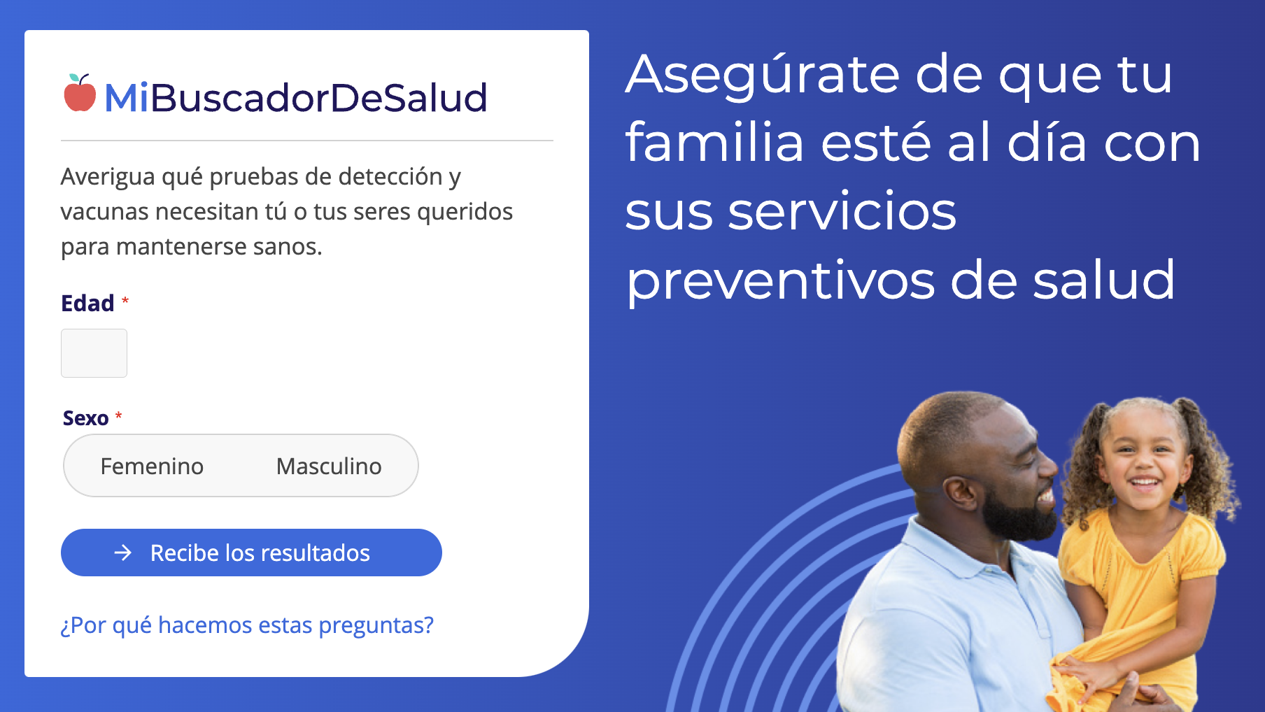
Clearmark award & MiBuscadorDeSalud, MyHealthfinder in SpanishCollaboration
Success rested on effective cross-functional teamwork:
Partnered with content specialists to refine messaging and ensure medical accuracy
Collaborated with developers to design within technical constraints
Integrated research insights to inform design decisions
Maintained regular communication with stakeholders
Coordinated with translation team to accommodate language differences
The greatest challenge was balancing medical accuracy with accessibility—requiring multiple review cycles to simplify language without sacrificing scientific precision.
